Amber Scrapbook Suitev1.0.2
Use this Skill to build website page.
Create a complete SaaS product experience with a marketing site, pricing and sign-in screens, a day-planning demo, and an admin dashboard in an amber scrapbook style. It suits teams that need a cohesive product story and believable working surfaces for launches, demos, or early product validation.
Picked most often by
Updated Aug 31, 2026
Preview gallery
Runs in
Generates with
Similar Skills
View all skillsWhat you get
- A complete SaaS product site in the amber scrapbook style — landing, pricing, sign-in, an AI-scheduler demo app, and an admin dashboard — as one self-contained hash-routed HTML file
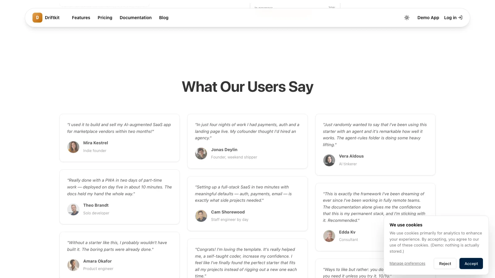
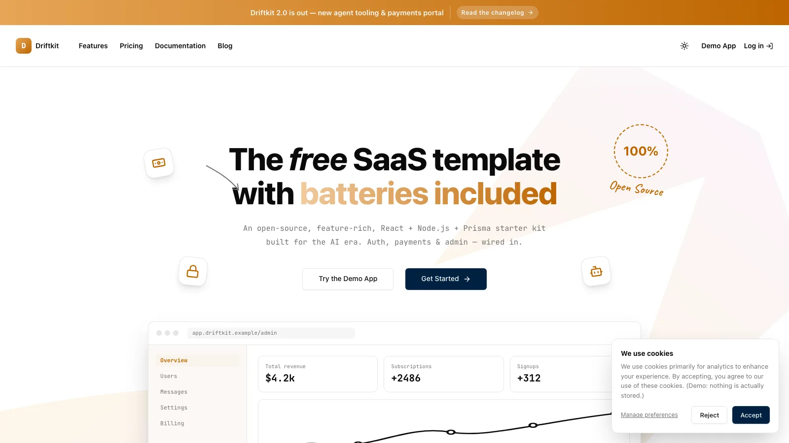
- The full scrapbook look: gradient-clause hero with handwritten annotations, rotated icon-tile stickers, tilted-mockup feature splits, a cream bento grid, a roadmap board, and masonry testimonials
- Light and dark themes plus a style guide, so the same design system can be regenerated inside your own React/Vue project
Good fit
- Developer tools, SaaS templates, and app starters that want a warm, hand-assembled look instead of a corporate gradient template
- Founders who need the whole product surface — marketing, pricing, app shell, and admin — mocked up convincingly in one artifact
- References with a yellow/amber palette, icon feature tiles, tilted polaroid-style screenshots, or a roadmap/kanban section
Not for
- Formal enterprise brands — the sticker-and-annotation look is deliberately playful
- Production apps with real auth, billing, or data — every interactive flow is a believable front-end simulation
- Single-section jobs like just a hero or just a pricing card — this Skill builds the whole multi-view suite
About this Skill

Amber Scrapbook Suite — guide
What you get
A complete SaaS product site in one self-contained HTML file, in the "amber scrapbook" style — the look of a well-loved open-source starter site:
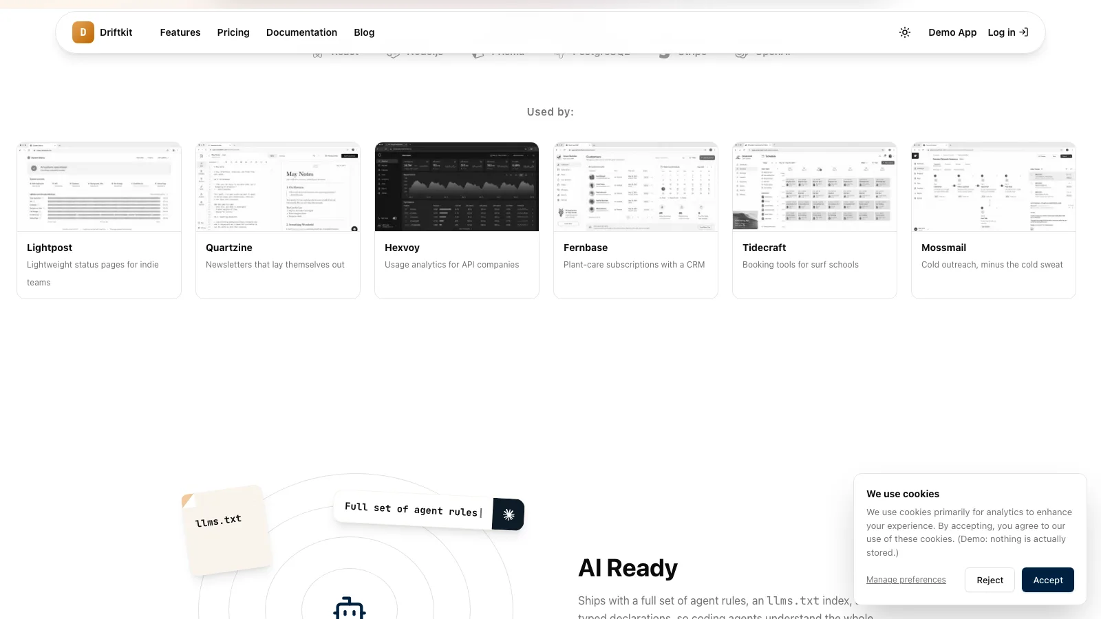
#/— the landing page: gradient announcement bar, a navbar that shrinks into a floating pill as you scroll, a hero with one gradient clause, inline-SVG stickers and a hand-annotated "100%" badge, a CSS browser-shot of the product's admin, a grayscale "Used by" row, four big tilted-mockup feature splits, a cream bento features grid with your logo in the center tile, a roadmap board, masonry testimonials, an FAQ, and an honest cookie card#/pricing— three plans with a highlighted "best deal" ring and a mono test-card chip#/signin— an honest demo sign-in with a one-click demo account#/app— a genuinely working demo app (an AI day scheduler by default): add tasks, cycle priorities, and spend credits generating a schedule#/admin— four stat cards, a revenue line chart, and two tables
Both light and dark themes ship and are toggleable. No build step, no frameworks, no network calls — the file opens from disk and runs inside a sandboxed iframe. Inside a real project, the skill generates the same design system in your own stack (React, Vue, Svelte, Astro, …) with real routes instead of the hash router.
How to brief it
- Product name + one-line promise — the promise becomes the hero, with its key phrase in the amber gradient.
- 8–10 features for the bento grid, plus the 3–4 flagship features that deserve the big tilted-mockup splits.
- Pricing shape — defaults to two subscriptions + a one-time credit pack.
- Roadmap items and any quotes you want adapted (fictional identities are generated otherwise).
Working with the output
- Plain HTML/CSS/JS — edit copy directly or ask for revisions.
- Demo state (credits, tasks, sign-in) is in-memory and resets on reload by design; the prototype never pretends to have a backend.
- After manual edits, run
node scripts/validate-suite.mjs your-file.htmlto confirm the file is still self-contained and structurally complete.
What you need before you start
- You bring
- Product name, one-line promise, 8-10 features, 3-4 flagship features, pricing shape, and roadmap items
- Last tested
- v1.0.2 — Claude Code / Claude Desktop / Cowork / Codex / ChatGPT
User reviews
Loading reviews…