自媒体视频动效 · 人物后大字接全屏宣言


 +6
+6
装上下面任意一个 Skill,再让你的 Agent 照着做一条这样的视频。
# OBLT E-bike Header

A full-viewport, dark, cinematic e-bike product header for the brand **OBLT**, built in React (client component) with pure CSS and an interactive cursor-following "x-ray" spotlight reveal — moving the mouse wipes away the bike's exterior photo to expose its internal carbon/gearbox structure underneath. Built with React only (no animation libraries).

## Tech stack (libraries actually imported)
- React only — `useRef`, `useState`, and the `MouseEvent` type. No framer-motion, no GSAP, no icon library. All animation is hand-written CSS keyframes + an inline CSS `mask-image`.
- SVG icon (the CTA arrow) is hand-inlined, not from a library.

## Fonts & global styles
- Single Google font, imported inside a `<style>` block:
  ```
  @import url('https://fonts.googleapis.com/css2?family=Almarai:wght@300;400;700;800&display=swap');
  ```
- Font stack: `"Almarai","Helvetica Neue",Helvetica,Arial,sans-serif`.
- `-webkit-font-smoothing: antialiased`. `box-sizing: border-box` applied to the root and all descendants (scoped to `.vt-header`, never global).

## Section container
- Root `<header className="vt-header">` is the mouse-tracking element (handlers: `onMouseEnter`, `onMouseMove`, `onMouseLeave`).
- Styles: `position: relative; display: flex; flex-direction: column; min-height: 100vh; overflow: hidden; padding: 32px 56px 44px; background-color: #272727; color: #fff;`.
- Internal vertical flow: top nav, then a flex-grow spacer "stage", then bottom content pinned to the base.

## Structure, section by section

### 1. Reveal background (`.vt-bg`, absolute inset:0, z-index 0, pointer-events:none)
Three stacked layers:
- **Base exterior image** (`.vt-bg-img`): the full bike exterior photo, `object-fit: cover; object-position: center;`, fills the layer. `user-select:none`, `-webkit-user-drag:none`, `referrerPolicy="no-referrer"`.
- **X-ray layer** (`.vt-bg-xray`, z-index 1): contains the bike x-ray/internal image (same cover/center sizing). This layer is masked by a radial gradient driven by cursor position (see Animations). `will-change: -webkit-mask-image, mask-image;` and `transition: -webkit-mask-image .12s linear, mask-image .12s linear;`.
- **Veil overlay** (`.vt-bg-veil`, z-index 2): a vertical darkening gradient so text stays legible top & bottom:
  ```
  linear-gradient(180deg, rgba(39,38,38,.62) 0%, rgba(39,38,38,.10) 26%, rgba(39,38,38,.10) 60%, rgba(39,38,38,.82) 100%)
  ```

### 2. Top nav (`.vt-nav`, z-index 30)
- `display: grid; grid-template-columns: 1fr auto 1fr; align-items: center; gap: 24px;`.
- **Logo** (left, `.vt-logo`): text `OBLT` followed by a `.` span. `font-size: 28px; font-weight: 700; letter-spacing: 0.5px; color: #E0E1CC;` (dot is also `#E0E1CC`).
- **Center menu** (`.vt-menu`, gap 40px): three links — `E-bikes`, `Features`, `Connect`. Each: `font-size: 16px; font-weight: 400; letter-spacing: .3px; color: #E0E1CC; opacity: .85; transition: opacity .2s ease;` hover → opacity 1.
- **Right cluster** (`.vt-nav-right`, gap 18px): an uppercase explore link plus a hamburger button.
  - `.vt-explore` link text: `Explore the bike` — `font-size: 14px; font-weight: 700; letter-spacing: 1.5px; text-transform: uppercase; color: #E0E1CC;` hover → opacity .65.
  - **Hamburger** (`.vt-burger`, hidden on desktop): 34×34px, three `#E0E1CC` bars 22×2px, radius 2px, gap 5px. On `.open`: bar 1 `translateY(7px) rotate(45deg)`, bar 2 `opacity:0`, bar 3 `translateY(-7px) rotate(-45deg)`. Transition `transform .25s ease, opacity .2s ease`.
- **Mobile dropdown** (`.vt-mobile-menu`, rendered only when `menuOpen`): absolutely positioned below the nav (`top:100%; margin-top:16px; z-index:40`), `background: rgba(20,19,19,.97); backdrop-filter: blur(10px); border: 1px solid rgba(255,255,255,.1); border-radius: 16px; padding: 8px 18px;`. Links (`E-bikes`, `Features`, `Connect`, `Explore the bike`): `color:#E0E1CC; font-size:18px; padding:14px 4px; border-bottom:1px solid rgba(255,255,255,.08)`; last link `border-bottom:none; font-weight:700`. Each link closes the menu on click.

### 3. Stage spacer (`.vt-stage`, z-index 30, `flex: 1 1 0%`)
- `display: flex; align-items: flex-start; justify-content: flex-end; padding-top: 22px;`. In the current markup it is an empty `aria-hidden` spacer (the `.vt-hint` pulsing-dot styles exist in CSS but the hint element is not rendered).
- (Reference: `.vt-hint` styled as an uppercase 11px/600 label with a 36px circle dot, `border:1px solid rgba(46,211,176,.5); color:#2ed3b1;` running `vtPulse 1.8s ease-in-out infinite`.)

### 4. Bottom content (`.vt-bottom`, z-index 30)
12-column grid: `grid-template-columns: repeat(12, 1fr); align-items: end; gap: 18px 32px;`.
- **Headline** (`.vt-headline`, `grid-column: 1 / span 8`): `<h1>` containing the word-stagger component. h1 style: `color: #E0E1CC; font-weight: 500; font-size: clamp(36px, 7vw, 116px); line-height: 0.85; letter-spacing: -0.07em; white-space: nowrap; margin:0;`. Text: **Ready For The Ride**.
- **Right block** (`.vt-right`, `grid-column: 9 / span 4; align-self: end; transform: translateY(22px);`):
  - Paragraph (verbatim): `An integrated gearbox, battery, and motor engineered in carbon and built to be seen. Every system, in the open.` Style: `font-size: 16px; line-height: 1.2; color: rgba(225,224,204,.7);` animates in via `vtFadeUp .8s cubic-bezier(.16,1,.3,1) both` with `animation-delay: .5s`.
  - **CTA button** (`.vt-cta`): label **Reserve yours** plus a circular arrow. Pill: `color:#000; background:#E0E1CC; border:none; border-radius:9999px; padding:6px 6px 6px 22px; font-size: clamp(14px, 1vw, 16px); font-weight:500; display:inline-flex; align-items:center; gap:10px;`. Animates via `vtFadeUp .8s cubic-bezier(.16,1,.3,1) both`, `animation-delay: .7s`. Hover → `gap: 14px`. Inner circle `.circ`: 40×40px, `border-radius:50%; background:#000;` containing the SVG (stroke `#E0E1CC`); on button hover `.circ` scales to `1.1` (`transition: transform .25s ease`).

## Assets (every URL)
- Exterior photo (base layer): `https://cdn.jiro.build/ARS/OBLT%20E%20Bike/bike-exterior.png`
- X-ray / internals photo (revealed layer): `https://cdn.jiro.build/ARS/OBLT%20E%20Bike/bike-xray-original.png`
- CTA arrow icon: inline SVG, 16×16, `viewBox="0 0 24 24"`, `stroke="currentColor"`, `stroke-width="2.2"`, round caps/joins, path:
  ```
  M5 12h14M13 6l6 6-6 6
  ```

## Animations

### Cursor "x-ray" spotlight (signature interaction)
- State: `hovering` (bool) and `pos` ({x,y} in px relative to the section's bounding rect). `handleMove` computes `e.clientX - rect.left`, `e.clientY - http://rect.top`.
- Constants: `RADIUS = 165` px (spotlight radius), `FEATHER = 45` px (soft edge). Inner fully-clear radius = `RADIUS - FEATHER` = 120px.
- The x-ray layer's `maskImage` / `WebkitMaskImage` is set inline. When hovering:
  ```
  radial-gradient(circle 165px at {x}px {y}px, #000 0, #000 120px, transparent 165px)
  ```
  When not hovering (collapsed to nothing):
  ```
  radial-gradient(circle 0px at 50% 50%, transparent 0, transparent 0)
  ```
- Mask transitions at `.12s linear` so the reveal trails the cursor smoothly. NOTE: in CSS `mask`, opaque (`#000`) areas KEEP the layer — so the circle reveals the x-ray image while the rest of that layer is hidden (showing the exterior beneath).

### Headline word pull-up (`WordsPullUp` component)
- Splits the headline on spaces; each word is an `inline-block` span (`margin-right: 0.22em`, last word 0). Each word animates `wpuUp` with `cubic-bezier(.16,1,.3,1) both`, default `duration = 0.6s`, staggered by `delayStep = 0.08s` (`animationDelay: i * 0.08s`).
- Keyframes:
  ```
  @keyframes wpuUp { from { transform: translateY(20px); opacity: 0; } to { transform: translateY(0); opacity: 1; } }
  ```
- Optional superscript asterisk (`.wpu-ast`, `font-size:0.31em; vertical-align:top; top:0.15em; left:-0.05em;`) — not enabled here (`asterisk` defaults false).
- Respects `@media (prefers-reduced-motion: reduce)` → `.wpu-word { animation: none; }`.

### Fade-up for right block (`vtFadeUp`)
```
@keyframes vtFadeUp { from { transform: translateY(20px); opacity: 0; } to { transform: translateY(0); opacity: 1; } }
```
Paragraph delay `.5s`, CTA delay `.7s`; both `.8s cubic-bezier(.16,1,.3,1) both`.

### Pulse (defined for hint dot)
```
@keyframes vtPulse { 0%,100%{transform:scale(1);opacity:.7} 50%{transform:scale(1.12);opacity:1} }
```
Applied `vtPulse 1.8s ease-in-out infinite`.

## Responsive
- **≤1000px**: padding `24px 28px 32px`; nav becomes `1fr auto` (logo + right); center `.vt-menu` and `.vt-explore` hidden; hamburger shown; `.vt-bottom` collapses to single column (`gap:16px`); headline & right span full width; `.vt-right` `transform:none; align-self:start; margin-top:4px; max-width:520px`.
- **≤600px**: padding `18px 20px 26px`; logo `font-size:22px`; headline `white-space:normal; font-size: clamp(40px, 13vw, 72px); line-height:0.92`; paragraph `font-size:15px; margin-bottom:16px`; CTA `font-size:14px; padding:5px 5px 5px 20px`; `.circ` 36×36px.

## Key design principles
- Dark stage (`#272727`) with a single warm-cream accent (`#E0E1CC`) and a teal accent (`#2ed3b1`) reserved for the (optional) pulse hint.
- The product reveal IS the hero: cursor acts as an x-ray torch over a layered photo pair.
- Editorial oversized headline (line-height 0.85, tight `-0.07em` tracking) anchored bottom-left; supporting copy + CTA bottom-right.
- Staggered, eased (`cubic-bezier(.16,1,.3,1)`) entrance for hierarchy.

## Common mistakes to avoid
- Don't invert the mask logic: opaque `#000` in the radial gradient REVEALS the x-ray layer; the transparent ring hides it. Getting this backwards shows internals everywhere except under the cursor.
- Keep `RADIUS - FEATHER` (120px) as the inner solid stop and `RADIUS` (165px) as the transparent stop — that 45px band is the soft feather.
- Mouse coordinates must be relative to the section rect (`getBoundingClientRect`), not the viewport.
- Mask transition is `.12s linear` only — a longer/eased transition makes the spotlight feel laggy.
- `white-space: nowrap` on the headline is intentional on desktop; only switch to `normal` at ≤600px.
- Scope all resets and the Almarai `@import` to the component; do not touch global `body`/`html`.

## Page title
OBLT — Ready For The Ride

## Integration (build-safety — do not skip)
- Add this section as a **new** component file with a unique name. Don't edit or overwrite any existing file except to add its import and render it.
- Render it **after** all existing sections; keep every previously built section exactly as-is — never replace or remove them.
- If no project exists, create a minimal React + Tailwind app; if one exists, use it as-is — don't re-scaffold or change the Tailwind/build config or version.
- Keep it self-contained: scope its fonts and any resets to this section; never set global `body`/`html`/`*` styles or a global font.
- Install only the libraries this section names.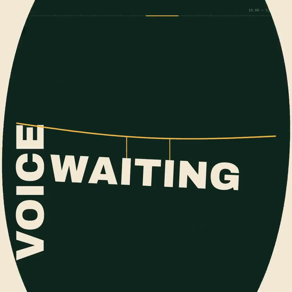 动效宣传0:20Create a 20.00-second kinetic spoken-word film titled “BUILD THE FLOOR.” Treat this as an original miniature speech staged entirely through typography. Every line changes the architecture of the frame. The final declaration must stand on something the earlier words physically constructed. Deliver one self-contained HTML file, 1080×1080, targeting 60fps, using SVG and/or Canvas. Embed all required assets. ART DIRECTION Background #102820. Paper # F4E9D5. Structural accent # F2B544. A literary editorial world with the scale and confidence of a public monument. Use a high-contrast serif for th…
 动效宣传0:14<inputs>
Ask me for: 8 to 12 UI states I want the shape to become (e.g. button, loader, player, slider, toggle, tabs, chart, command palette, toast), pure black and white or one accent color, and a royalty-free song around 120 BPM (e.g. Mixkit, free for commercial use).
</inputs>
<direction>
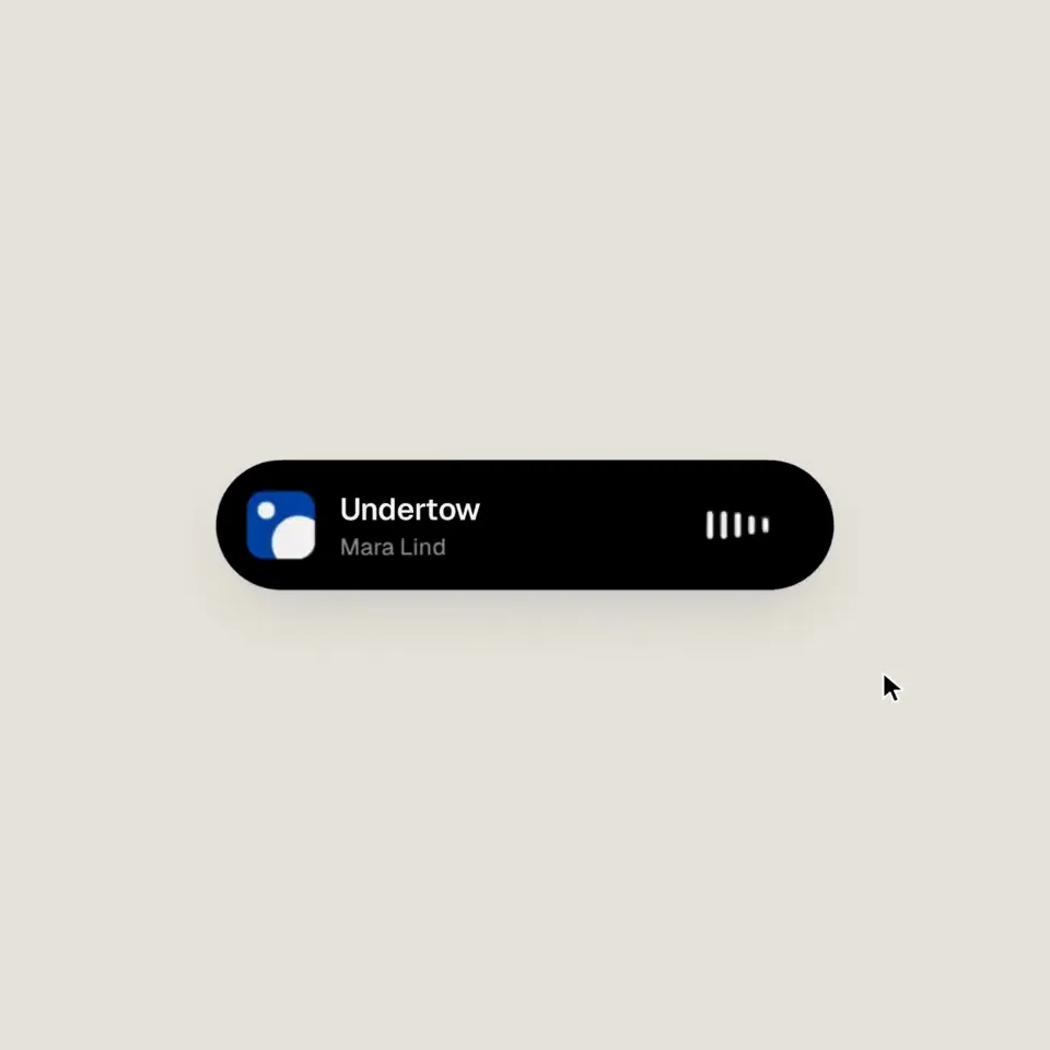
Dribbble-level UI motion. One shape, never cut: every state is the same element morphing its size, radius and color while its content swaps with a short blur. A cursor drives every change with real clicks and drags. Light warm-gray canvas, black and white components, one clean UI font (Geist). Springs eve…
动效宣传0:14<inputs>
Ask me for: 8 to 12 UI states I want the shape to become (e.g. button, loader, player, slider, toggle, tabs, chart, command palette, toast), pure black and white or one accent color, and a royalty-free song around 120 BPM (e.g. Mixkit, free for commercial use).
</inputs>
<direction>
Dribbble-level UI motion. One shape, never cut: every state is the same element morphing its size, radius and color while its content swaps with a short blur. A cursor drives every change with real clicks and drags. Light warm-gray canvas, black and white components, one clean UI font (Geist). Springs eve…